

Introduction
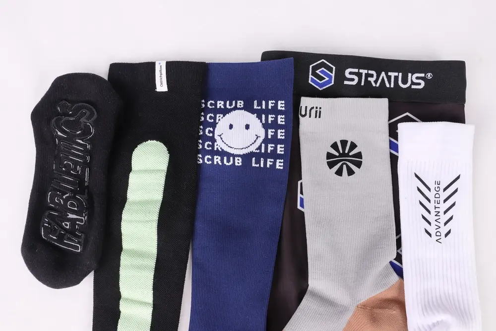
When you’re developing a custom-branded sock, the logo technique you choose affects more than just appearance — it affects durability, comfort, lead time, and unit cost. A technique that works perfectly for one logo will fail on another, and the wrong choice usually only becomes obvious at the sampling stage, after time and money have already been spent.
This guide covers every major logo technique used in sock manufacturing, what each one is suited for, and how to match your logo design to the right method before briefing your factory.
If you’re still deciding between knitting a pattern directly into the sock or adding it as a print, this article on jacquard vs. sublimation printing covers that decision in detail.
The 6 Main Logo Techniques for Custom Socks
1. Jacquard / Knitting
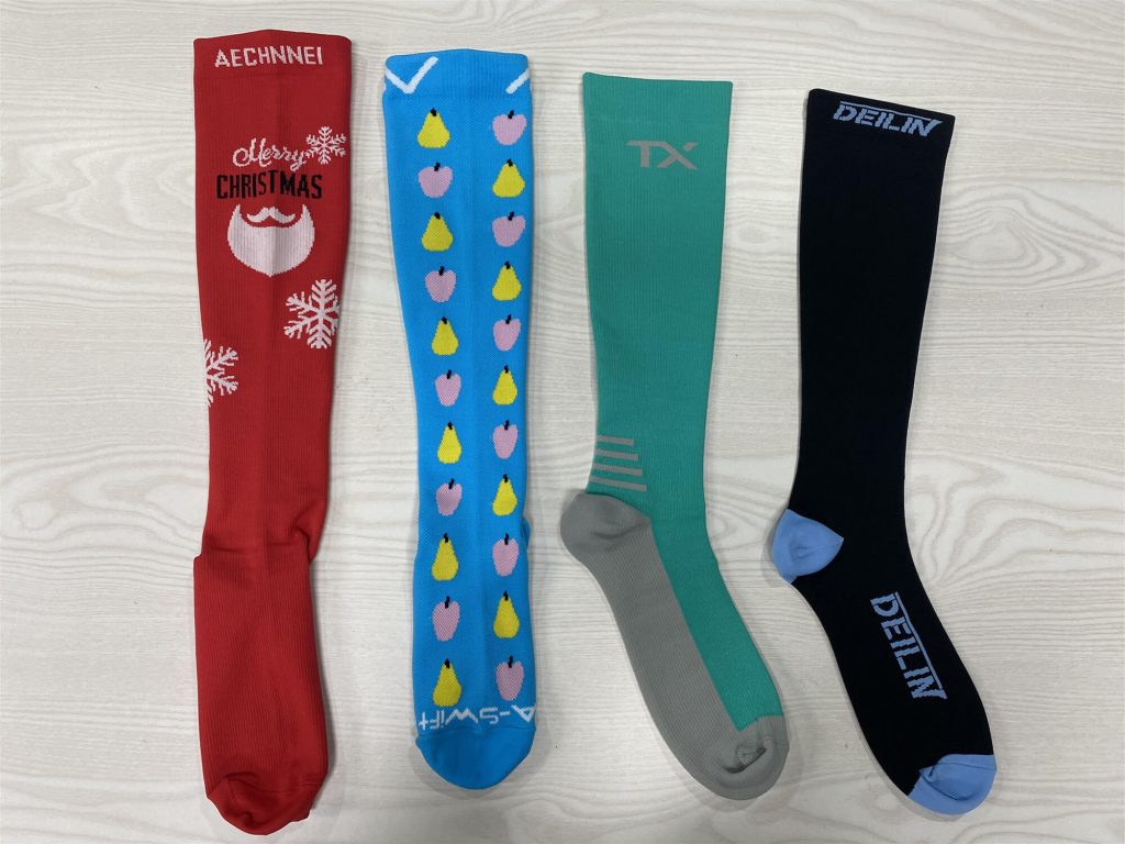
Jacquard is the most common logo technique — the design is woven directly into the sock fabric during the knitting process. Before production, an engineer converts your artwork into a pixel-grid map where each square represents one stitch. The machine then selects the correct yarn color at each needle position to build the pattern row by row.
Because each stitch is relatively large compared to a screen pixel, jacquard works best with simple, bold designs: clean text, geometric shapes, and logos with clearly defined outlines. Fine serif fonts, thin lines under ~3mm, and complex gradients will not reproduce accurately — the edges come out stepped rather than smooth.
Color is also a practical constraint: most jacquard designs are limited to 6 colors or fewer, including the base sock color. If your logo requires more colors or any gradient transitions, jacquard is not the right process.
The advantage is durability — because the color is built into the yarn structure rather than applied on top, a jacquard logo will never crack, peel, or fade regardless of how many times the sock is washed.
The needle count of the knitting machine affects how precisely your logo reproduces. A 200N machine produces finer stitches and cleaner edges on detailed logos compared to 144N. If your logo has any fine detail, it’s worth discussing needle count with your factory at the spec stage — this guide explains the difference.
2. Embroidery
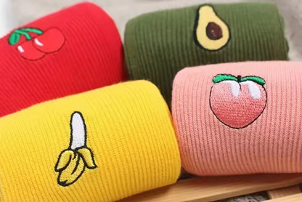
Embroidery is a secondary operation applied after the sock is knitted — a separate embroidery machine stitches the design onto the surface of the finished sock using thread.
The result has a raised, three-dimensional texture that reads as premium. Brands like Stance use embroidered logos precisely because the tactile quality communicates quality at point of sale in a way that flat techniques don’t.
The practical constraints: because the embroidered area creates a thickened patch on the sock surface, size matters for comfort. We recommend keeping embroidery logos to ≤3×3cm in diameter. Larger embroidery patches create stiffness and pressure points against the foot, particularly noticeable in athletic products worn for extended periods.
Embroidery handles moderate design complexity better than jacquard — it can reproduce curves and moderate detail more cleanly — but it still doesn’t suit very fine lines or photographic detail.
Position-wise, embroidery is most commonly placed on the cuff or ankle area where the stiffness is less noticeable against the leg than it would be under the foot.
3. Printing
Printing covers two distinct techniques with different applications:
Sublimation printing transfers full-color designs onto the sock surface using heat and pressure. It supports unlimited colors, gradients, and photorealistic artwork — effectively anything you can design digitally. The main constraints are material (requires ≥50% polyester) and base color (only works on white or light base fabric). High-temperature pressing also partially reduces elasticity, which matters for performance and compression products.
Screen printing is used for small-area applications only — typically a brand mark or single graphic within ≤5×5cm. It works on a wider range of fabrics than sublimation and can be applied to dark base colors, but it can’t handle gradients or complex multi-color designs economically.
For a full breakdown of when to use each printing method — including the material and elasticity trade-offs — this article covers it in detail.
4. Label Sewing
A woven or printed label is manufactured separately and sewn onto the sock as a secondary operation. This is the same principle as a care label on a garment — the label itself carries the brand mark, and it’s attached to the sock rather than embedded in it.
The advantage of label sewing is flexibility: the label can carry any design regardless of the sock’s fabric, color, or construction, because it’s a separate material. This makes it a good option when the sock design itself doesn’t leave a suitable space for knitting or printing a logo, or when the label needs to include regulatory information alongside the brand mark.
Common placement is inside the cuff, or as a small flag label on the outside of the ankle.
Labels can be woven (higher-end, more durable, suitable for complex logos with fine text) or printed (faster lead time, lower cost, suitable for simpler designs and large quantities).
5. Reflective Logo
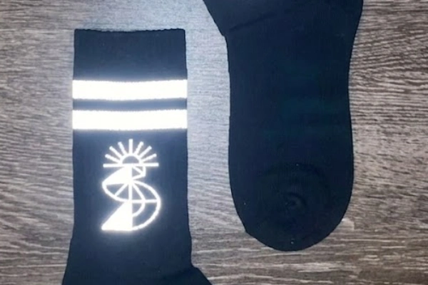
A reflective logo uses retroreflective material — typically a heat-pressed reflective film or tape — applied to the sock surface after boarding. The material contains glass beads or prism structures that reflect light directly back toward the light source, making the logo visible in low-light conditions.
This technique is used almost exclusively on running, outdoor, and safety-oriented socks where nighttime or low-light visibility is a functional requirement. Many running brands include a small reflective element on the ankle or calf panel as a safety feature.
The design must be simple — reflective materials don’t reproduce complex gradients or fine detail. Clean geometric shapes, brand initials, or simple wordmarks work well. Most reflective logos are applied as small elements (≤5×5cm) rather than all-over patterns.
6. Grip Logo
Grip logos are silicone prints applied to the sole or interior surface of the sock, primarily on non-slip products: yoga and pilates socks, football grip socks, trampoline park socks, hospital fall-prevention socks, and similar categories.
The silicone is applied through a screen-printing process after boarding — a custom screen is made for each design, and the silicone is pressed through the screen and cured under heat. Because the grip pattern is functional (it provides the non-slip surface), and the logo is incorporated into that same silicone layer, branding and function are achieved in a single operation.
Most customers opt to incorporate their brand logo into the grip pattern itself — for example, a logo shape cut out of the grip field, or the brand name rendered in silicone text within the grip area. The size and layout is constrained by the grip coverage area and the screen dimensions.
For products where grip is a primary feature, our custom grip socks page shows the range of grip patterns and customization options available.
Quick Comparison: All 6 Techniques
| Technique | Best For | Size Range | Durability | Effect on Comfort | Cost Level |
| Jacquard | Simple logos, ≤6 colors, all order volumes | Any area | Highest — color in yarn | None | Low |
| Embroidery | Medium-complexity logos, premium feel | ≤3×3cm recommended | High | Slight stiffness at logo area | Medium |
| Sublimation printing | Complex/full-color logos, polyester fabric | Large area / all-over | Good | Slight elasticity reduction | Medium |
| Screen printing | Simple logos on any fabric | ≤5×5cm | Good | None | Low–Medium |
| Label sewing | Any design, independent of sock fabric | Label size | High | None | Low |
| Reflective | Running, outdoor, safety products | Small–medium | High | None | Medium–High |
| Grip logo | Non-slip sock products | Per grip coverage | Good | None — is the grip | Medium |
Logo Size Decision Guide
Size is often the deciding factor when choosing between techniques. Use this as a starting reference:
Under 3×3cm: Jacquard (simple design), embroidery, screen printing, or labeling all work. Jacquard is the most cost-efficient for volume; embroidery gives the best premium texture.
3–5cm: Jacquard (if design is simple enough), embroidery at the upper limit of comfort, screen printing, sublimation printing. Avoid embroidery if the logo will sit in a high-friction area against the foot.
Over 5×5cm: Sublimation printing is the primary option for complex logos. Screen printing works for simple designs at this size. Embroidery is not recommended — the patch becomes uncomfortable.
Full-coverage or all-over design: Sublimation printing only.
Logo Placement on Socks
There are no technical restrictions on where a logo can be placed, but some positions are more effective than others for brand visibility.
The most common placement for B2B branded socks is the upper ankle panel — on the left and right sides, or centered on one side. This position is visible when the sock is worn with low-cut shoes or visible above the shoe line, and it’s the area most commonly shown in product photography.
Other positions include the cuff top (visible when folded down), the instep or toe area (less visible during wear but prominent in flat-lay photography), and the sole (not visible during wear, but used for grip logos and sometimes for manufacturer marks).
For brands using embroidery, the cuff is preferred over the foot and ankle area to minimize the pressure point from the raised patch.
Logo Color: Pantone Matching
There is no limit on the number of colors available for most techniques — with the exception of jacquard, which is limited to the number of yarn feeds on the machine (typically up to 6 colors per design).
For accurate color matching, provide your logo files with Pantone color codes specified. Pantone is the industry standard for sock manufacturing; our production team works from Pantone references to select yarn colors and printing inks. Without a Pantone reference, we match to your provided artwork as closely as possible, but screen color and physical yarn color are different mediums — some deviation is unavoidable without a color standard.
Logo File Requirements
Preferred format: AI or PDF (vector) Vector files can be scaled to any size without quality loss, and Pantone color references are embedded in the file. This is what our design team works from when creating the production grid for jacquard, or preparing print files.
Acceptable: High-resolution JPG or PNG (minimum 300dpi at production size) Lower-resolution files will appear blurry when scaled up to the design grid, particularly for jacquard where each pixel corresponds to a physical stitch. A logo that looks sharp on screen at 72dpi will look significantly worse in production. If you only have a JPG, make sure it’s the highest-resolution version available.
Trademark check: Before finalizing your logo for production, verify that it hasn’t been registered by another party in your target market. If you’re unsure, contact us — we can point you to the relevant trademark search resources for your market.
FAQ
Can I use my brand logo as a jacquard pattern on socks?
Yes, as long as the design meets the constraints of the technique: typically ≤6 colors, no gradients, and no very fine lines or detail smaller than approximately 3mm. If your logo is too complex for jacquard, embroidery or printing are the alternatives depending on size and fabric. Send us your logo file and we’ll assess it directly.
What is the maximum size for an embroidery logo on socks?
We recommend keeping embroidery logos to ≤3×3cm in diameter. Larger patches create a thickened, stiff area that causes pressure and friction against the foot — particularly noticeable in athletic or compression socks worn for extended periods. For logos that need to be larger than 3×3cm, sublimation or screen printing is more comfortable.
What file format should I provide for my sock logo design?
AI or PDF (vector format) is preferred. These formats allow our design team to scale the artwork cleanly and extract accurate Pantone color references. If you only have a JPG or PNG, provide the highest resolution version available — minimum 300dpi at the intended production size. Low-resolution files produce blurry results in production, especially for jacquard.
What is a reflective logo on socks, and what products is it suitable for?
A reflective logo uses retroreflective film material heat-pressed onto the sock surface, making it visible when light hits it directly — useful in low-light conditions. It’s primarily used on running socks, outdoor hiking socks, and safety-oriented products. The design must be simple (clean shapes or text); reflective material cannot reproduce gradients or fine detail.
Can I combine multiple logo techniques on the same sock?
Yes, and this is relatively common for premium products. A typical combination might be a jacquard pattern across the body of the sock with a small embroidered logo on the cuff, or a silicone grip logo on the sole combined with a knitted brand name on the leg. Each technique is a separate production operation, so combinations add to lead time and cost — but they’re technically straightforward to specify.
Conclusion
The right logo technique comes down to three things: what your design actually looks like, where it needs to go, and what the sock is made of. Most sourcing delays and sampling revisions on logo issues trace back to a mismatch between the artwork and the technique — a gradient logo briefed as jacquard, or a large embroidery spec that creates a comfort issue.
Send us your logo file and target product spec before committing to a technique. We’ll review it and give you a straight recommendation on which method works and why.